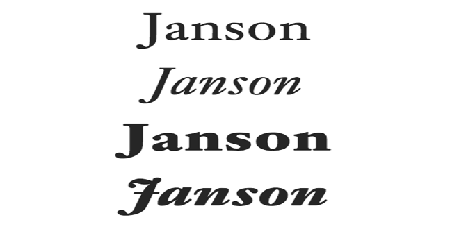
The right fonts for book design are often overlooked but undeniably influential in shaping a reader’s experience. The choice of fonts can greatly impact readability, aesthetics, and the overall impression of a book. This article will explore the world of book fonts and introduce exceptional typefaces from typetype foundry. These fonts have gained recognition for their versatility and readability in book design.
TT Rationalist
TT Rationalist is a modern and versatile sans-serif typeface designed by the TypeType team. It balances tradition and contemporary design, making it an excellent choice for many book genres. Here are key features:
- Geometric, clean lines for a minimalist and professional appearance.
- Well-balanced letterforms and consistent character spacing ensure excellent readability. Multiple weights and styles (Regular, Italic, Bold, and Bold Italic) for flexible design options.
- Support for multiple languages, making it accessible to a global audience.
When to Use TT Rationalist
TT Rationalist is perfect for non-fiction books, academic publications, and modern literature. It is legible and clean design ensures readers can focus on the content without distraction. It’s also suitable for e-books, where digital displays require clarity and consistency.
TT Livret
TT Livret, designed by TypeType, is a serif typeface inspired by the classic fonts of old books and manuscripts. It exudes a timeless charm and elegance that can elevate the visual appeal of your book. The key features of TT Livret include:
- Serif design with subtle calligraphic elements for a classic and refined look.
- Thoughtfully designed ligatures and alternates to enhance readability and aesthetics.
- For versatile design possibilities, multiple weights and styles (Regular, Italic, Bold, and Bold Italic).
- Supports various languages, facilitating a broad readership.
When to Use TT Livret
TT Livret is an excellent choice for classic literature, historical novels, poetry, and any book that evokes nostalgia or tradition. Its unique blend of classic and modern elements makes it adaptable to print and digital formats.
TT Interphases Pro
TT Interphases Pro, created by TypeType, is a contemporary sans-serif typeface that offers a clean, readable design with a touch of modernity. Its versatility and legibility make it suitable for many book projects. The key features of TT Interphases Pro include:
- A geometric sans-serif with a modern and approachable appearance.
- Open letterforms and balanced proportions for easy reading.
- Extensive character set and language support for global accessibility.
- For diverse design choices, there are multiple weights and styles (Thin, Extra Light, Light, Regular, Medium, Bold, and Black).
When to Use TT Interphases Pro
TT Interphases Pro is a versatile choice for various genres, including fiction, self-help, and business books. Its modern aesthetic ensures your book looks contemporary and engaging while maintaining readability, especially on digital devices.
Conclusion
Selecting the right font for your book is a critical decision in the design process. The fonts you choose will influence how your readers perceive and engage with your content. TT Rationalist, TT Livret, and TT Interphases Pro are three outstanding options catering to different styles sans serif fonts and genres, but all are committed to readability and aesthetics. Ultimately, the best font for your book will depend on your specific project’s goals and audience, so consider these options carefully and choose the one that best aligns with your vision.
 Isaiminia World Breaking News & Top Stories


