 Isaiminia World Breaking News & Top Stories
Key Takeaways
- Vehicle graphics need to communicate in a short viewing window.
- A business name, primary service, and one contact method are often enough.
- Large type, strong contrast, and generous spacing improve quick recognition.
- Doors, seams, handles, windows, and wheel wells should shape the layout.
- A full-size proof helps catch readability and placement problems before installation.
- Consistent fleet graphics can give Austin businesses a more unified presence.
A company vehicle can be seen on Mopac, at a job site in Round Rock, or parked in a neighborhood driveway. Unlike a website or brochure, though, vehicle graphics are usually seen for only a moment. The design must make sense quickly, whether the vehicle is moving, the viewer is moving, or both are in traffic.
For businesses evaluating truck decals Austin, Hightech Signs provides custom decals, magnets, and graphics for cars, trucks, vans, trailers, and other business vehicles. As an Austin sign company with experience installing vehicle graphics for local organizations, Hightech Signs can help businesses translate a logo and service message into a layout suited to real vehicle panels and everyday travel throughout the Austin area.
Start With One Message People Can Grasp Quickly
The first decision is not color or imagery. It is the main message. A vehicle should tell people who the company is and what it does without requiring them to read a paragraph. For a plumber, landscaper, appliance repair company, or contractor, a concise service phrase can be more useful than a long list of capabilities.
Examples of focused messages include “Residential Plumbing,” “Local Tree Care,” “Same-Day Appliance Repair,” and “Commercial Landscaping.” The business name, primary service, and contact method deserve the most visual attention. Social media handles, lengthy taglines, license details, and secondary services may be important, but they should not compete with the message a driver needs to notice first.
That approach follows the same basic principles used for fast-reading transportation signs. The Federal Highway Administration’s discussion of sign lettering emphasizes the effect of information quantity, letter size, contrast, and spacing when people have limited time to recognize a message.
Choose a Type That Works Beyond the Parking Lot
A font that looks polished on a computer screen can become difficult to decipher from another lane of traffic. Favor familiar, sturdy typefaces with open letter shapes and enough stroke weight to remain visible against changing backgrounds. Thin scripts, compressed lettering, and overly decorative styles can make names and phone numbers harder to identify at a glance.
Simple Type Checks
- Use bold lettering for the most important words.
- Leave space between letters, lines, and separate information blocks.
- Keep service descriptions short whenever possible.
- Use mixed case when it makes a name easier to recognize naturally.
- Review phone numbers, websites, and email addresses character by character.
View a mockup from the distances where people will realistically encounter the vehicle. A design may be readable when viewed from beside a van, yet fail when seen from a nearby intersection or a queue of cars.
Use Contrast Before Adding More Color
Strong contrast matters more than using every brand color. Dark lettering on a light field or light lettering on a dark field can give the message a clear visual edge. This is especially important in Austin, where a vehicle may be viewed in bright sunlight, in the shade beneath trees, during dawn traffic, or under evening conditions on the same day.
Avoid setting small copy over busy photos, camouflage-like patterns, detailed illustrations, or reflective metallic areas. If the brand uses a complex image, reserve it for a large background area and place the core message on a clean color panel. The viewer should not have to search for the business name.
Design for the Vehicle, Not a Flat Rectangle
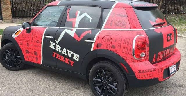
Vehicles have curved body panels, fuel doors, handles, windows, wheel arches, hinges, and seams. A balanced layout on a flat proof can become fragmented when it is installed across those features. Each side, rear panel, and hood or front area should be treated as its own communication space.
- Map the usable panels before placing the logo or text.
- Keep phone numbers and web addresses away from deep seams and door edges.
- Do not split the business name across doors that open independently.
- Check the appearance with sliding doors, cargo doors, and liftgates open.
- Keep graphics clear of areas that could interfere with driver visibility.
- Give the rear of the vehicle a concise message for following traffic.
For example, a service van can look perfectly composed when its side door is closed. At a customer location, the same door may remain open for hours, leaving half of the company name or contact number visible. Planning for that everyday use prevents an avoidable problem.
Match the Graphic Format to the Business Need
There is no single correct format for every Austin fleet or owner-operated truck. The right choice depends on the vehicle, the amount of information required, the desired coverage, and whether the branding must be removable.
- Cut vinyl decals: A practical option for names, logos, phone numbers, and simple service descriptions.
- Printed graphics: Useful for detailed artwork, gradients, photographs, or multi-color designs.
- Vehicle magnets: A removable choice for businesses that do not want permanent graphics on every vehicle.
- Partial wraps: A way to create stronger visual coverage while leaving some original paint visible.
- Full wraps: Appropriate when a brand system calls for broad, continuous coverage across multiple panels.
Create a Clear Reading Order
A good layout guides the eye instead of giving every element equal weight. In most cases, the visual order should be business name or logo first, main service second, phone number or website third, and a short call to action only if space permits. The rear panel may carry a version of that message because drivers behind the vehicle can often view it longer than a passing side panel.
Consistency matters for fleets. When multiple trucks, vans, or trailers use the same logo position, colors, type hierarchy, and service language, the vehicles are easier to recognize as part of one business. Consistent placement also makes later additions to the fleet easier to plan.
Review the Proof Before Production
Proofing is the final opportunity to correct a small problem before it becomes a large installed graphic. Ask to see the artwork on a vehicle template that reflects the actual make, model, and panel configuration whenever possible.
- Review the design at full scale or in a large-format proof.
- Check it from several distances and angles.
- Confirm spelling, phone numbers, domains, and logo versions.
- Look at color choices in daylight, not only under office lighting.
- Confirm that important content clears handles, seams, lights, and windows.
- Ask someone unfamiliar with the business what they notice first.
Maintain Graphics So They Continue to Read Well
After installation, regular washing and quick inspections help preserve a professional appearance. Road film, dirt, lifted edges, scratches, and outdated contact details can weaken an otherwise effective design. Use mild soap and soft cleaning materials, avoid unapproved solvents, and address damaged sections before moisture and debris can work beneath the graphic.
Conclusion
Clear vehicle graphics do not need to explain everything a business does. They need to deliver the right information quickly and reliably. By prioritizing a single message, readable typefaces, strong contrast, thoughtful panel planning, and careful proofing, Austin businesses can create vehicle graphics that look professional at the curb, in traffic, and at the job site.